
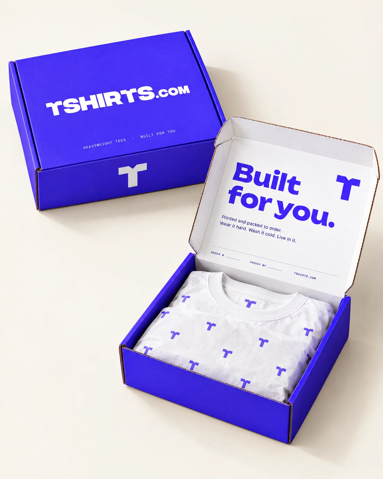
Outer box
Mailer Box
- 12 × 9 × 3 in roll-end tuck-front
- E-flute corrugated
- Electric blue outside, white inside
- Our standard ship box

Logo system
The shirts aren’t printed onto the wordmark. They’re cut out of it. Read the negative space and they’re there — a crewneck collar notched into the first T, a shoulder line carried through the second. Nothing is drawn on top, so the mark is one shape, and one shape holds anywhere.
That restraint is what lets it travel. The same letters sit cleanly in a 16-pixel favicon, on a 2 × 3.5 in hang tag, and on the label of a 500-shirt order, so the mark works for one customer or a crowd of two thousand without a simplified version.
The tone is deliberate: minimal and elegant first, with the color and confidence of a modern brand. Never cutesy. The shirt hiding in the lettering is a nod, not a punchline — the kind of detail people catch a beat later and smile at.
The collar-notched letter on its own, for where space is tight.
Color
Brand Blue
#4C29FF
Packaging and print
Site Blue
#0B2CC9
Web UI
Ink
#0F0A33
Text
White
#FFFFFF
Primary ground
Paper
#F5F3EE
Backgrounds
Kraft
#C9A57B
Shipper stock
Type
Sora
Headlines and moments of emphasis.
Manrope
Everything shoppers need to read and use.
Labels uppercase tracked
The wordmark itself is custom-drawn and never set in a font.
Voice
“Built for you.”
“A custom T-shirt worth wearing.”
“Better-designed graphics. Better-fitting shirts.”
“Printed and packed to order.”
Name the fit and fabric. Give people useful specifics they can choose from.
Skip hype words. Be confident, human and direct.
The full packaging system
Every piece, from the outer box to the hang tag, in one system.
Outer box
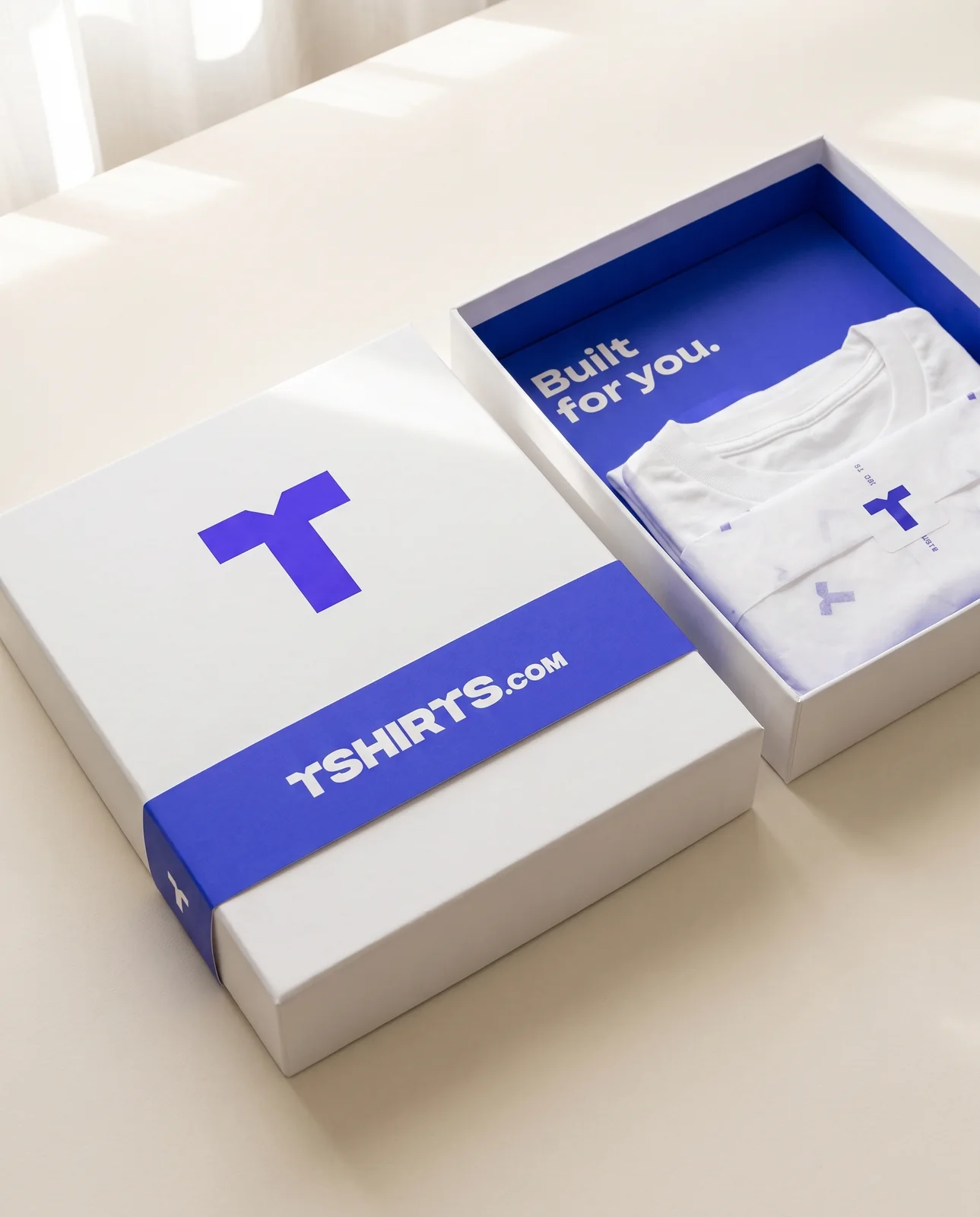
Outer box
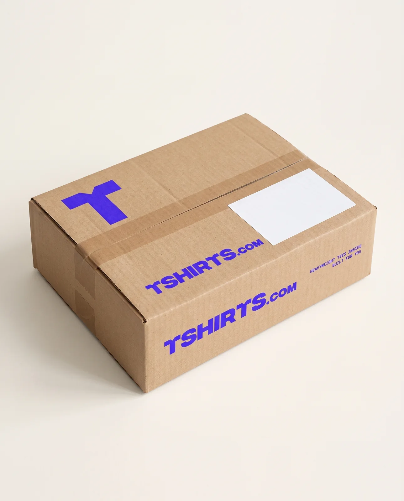
Outer box
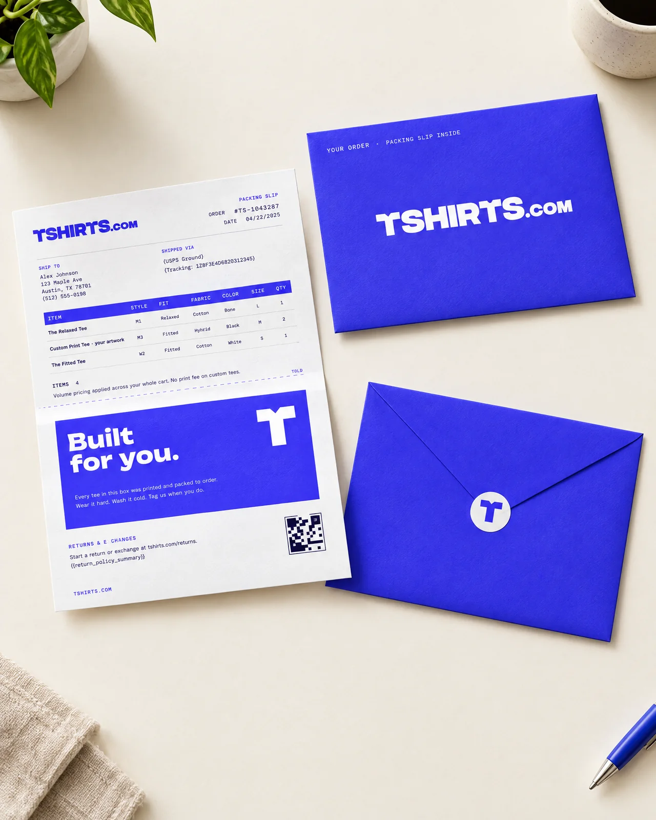
Inside the box
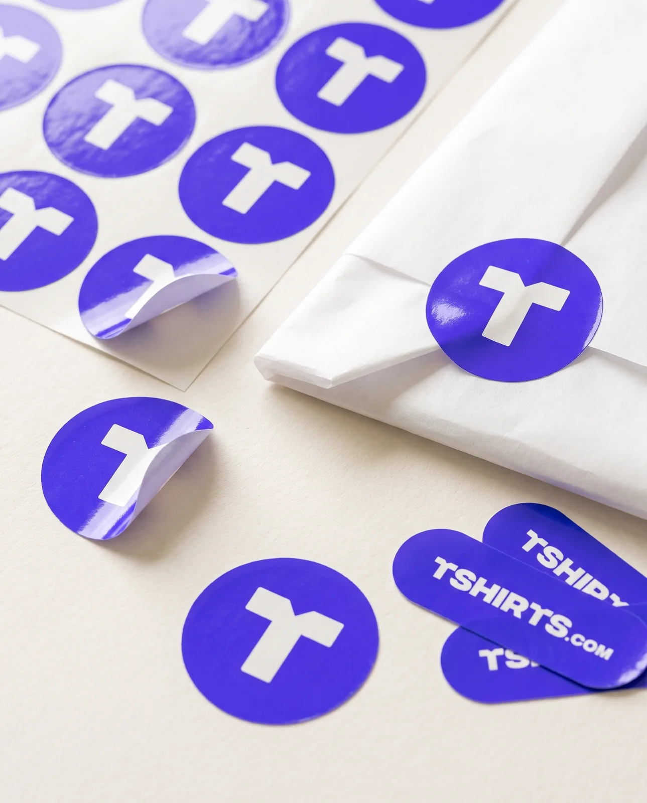
Inside the box
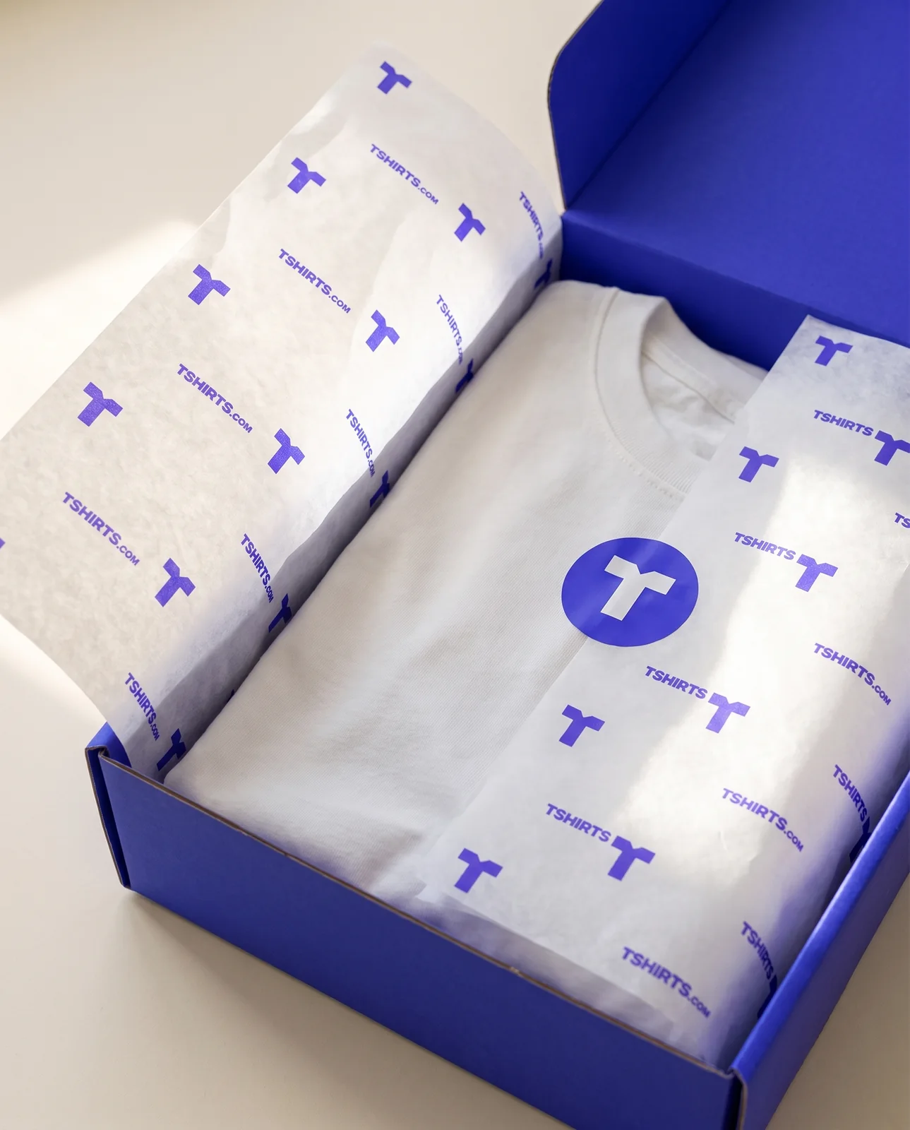
Inside the box
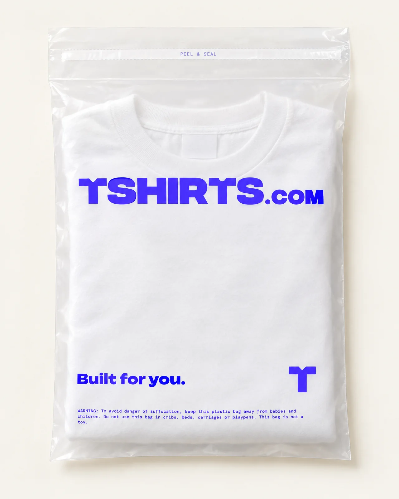
Inside the box
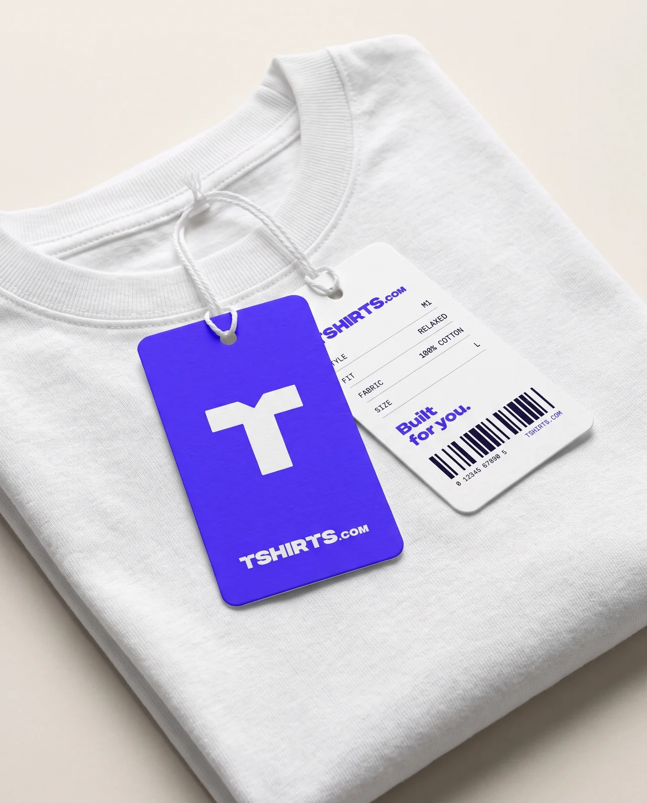
Inside the box
Flat artwork, print specs and image prompts for every piece.